The Sea Howls From The West
Dev Diary
And another jump in time 😅
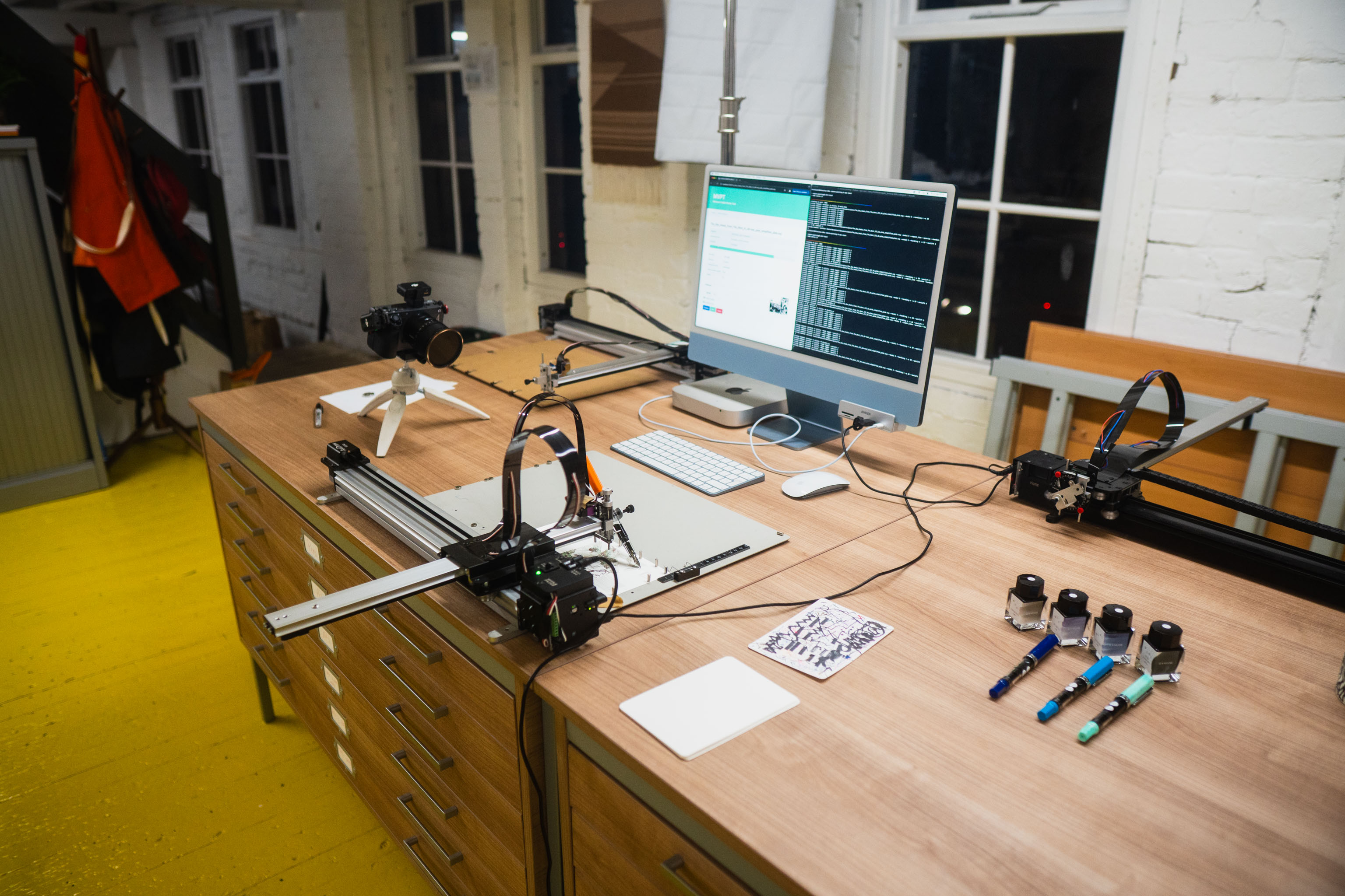
Since starting the project I bought myself a printer, and having decided after all my pen plotting ink tests that I did indeed want to use the inks I figured it was time to focus on the design and try to move the whole things forward.
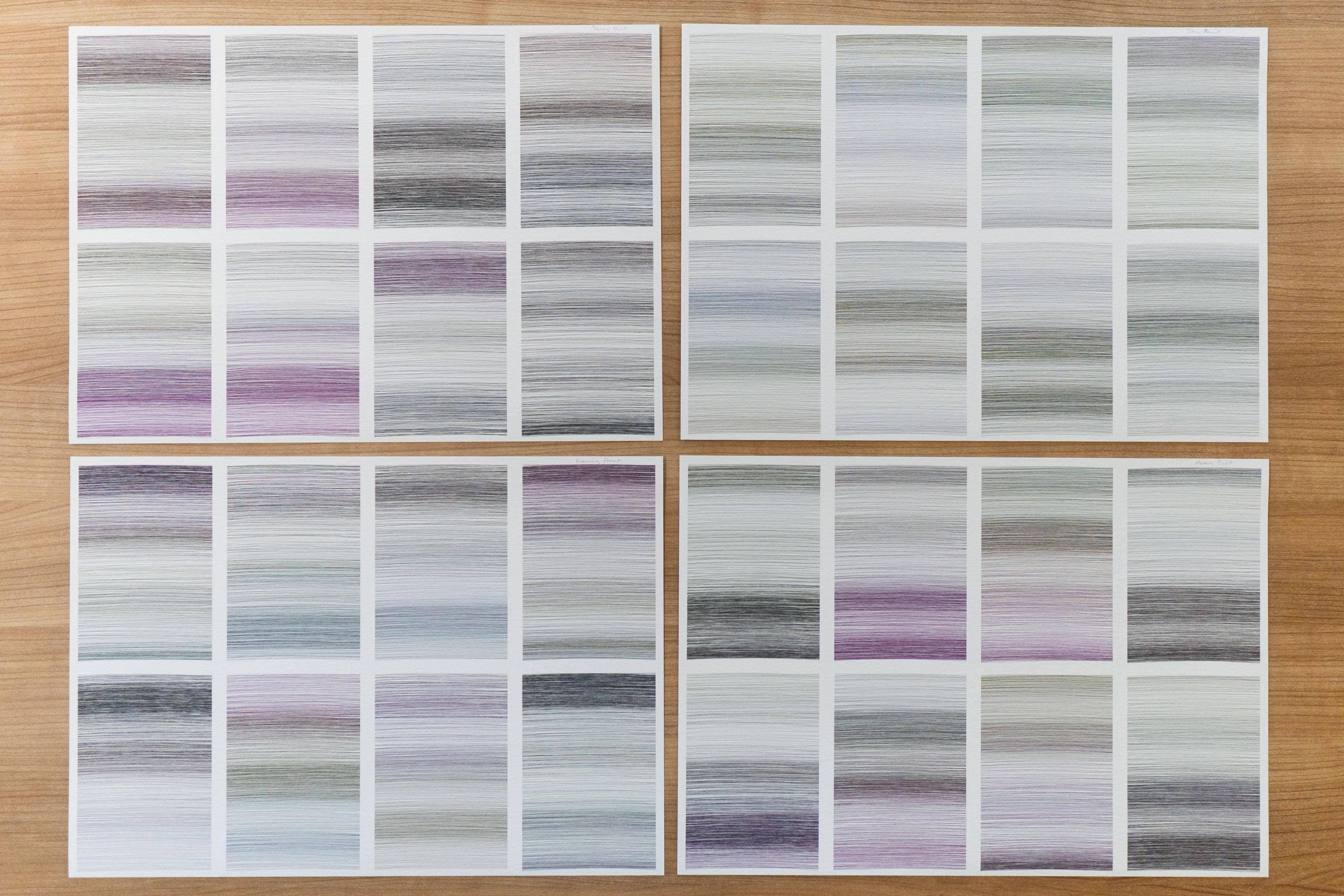
One thing I had noticed was my current design looked too dark. What was happening was in testing the inks I ended up with four dark inks and 12 light inks. Then wrote the code to pick two of the dark inks at random to start and end the plot with, the remaining four colours would then be picked from the rest of the light colours and the remaining two dark colours.
We'd often end up with three dark colours and three light colours in the design and too often the end result was over powered by those dark shades.
So here I decided to call that outcome "Stormy", and update the code to have "Evening" where we only picked one dark colour to end the plot with, "Morning" to start the plot, and "Daytime" where no dark colour was intentionally picked (although it could still appear in the random pool of colours).
This gave subtly different outputs, but more importantly the whole collection wouldn't be overly dark.
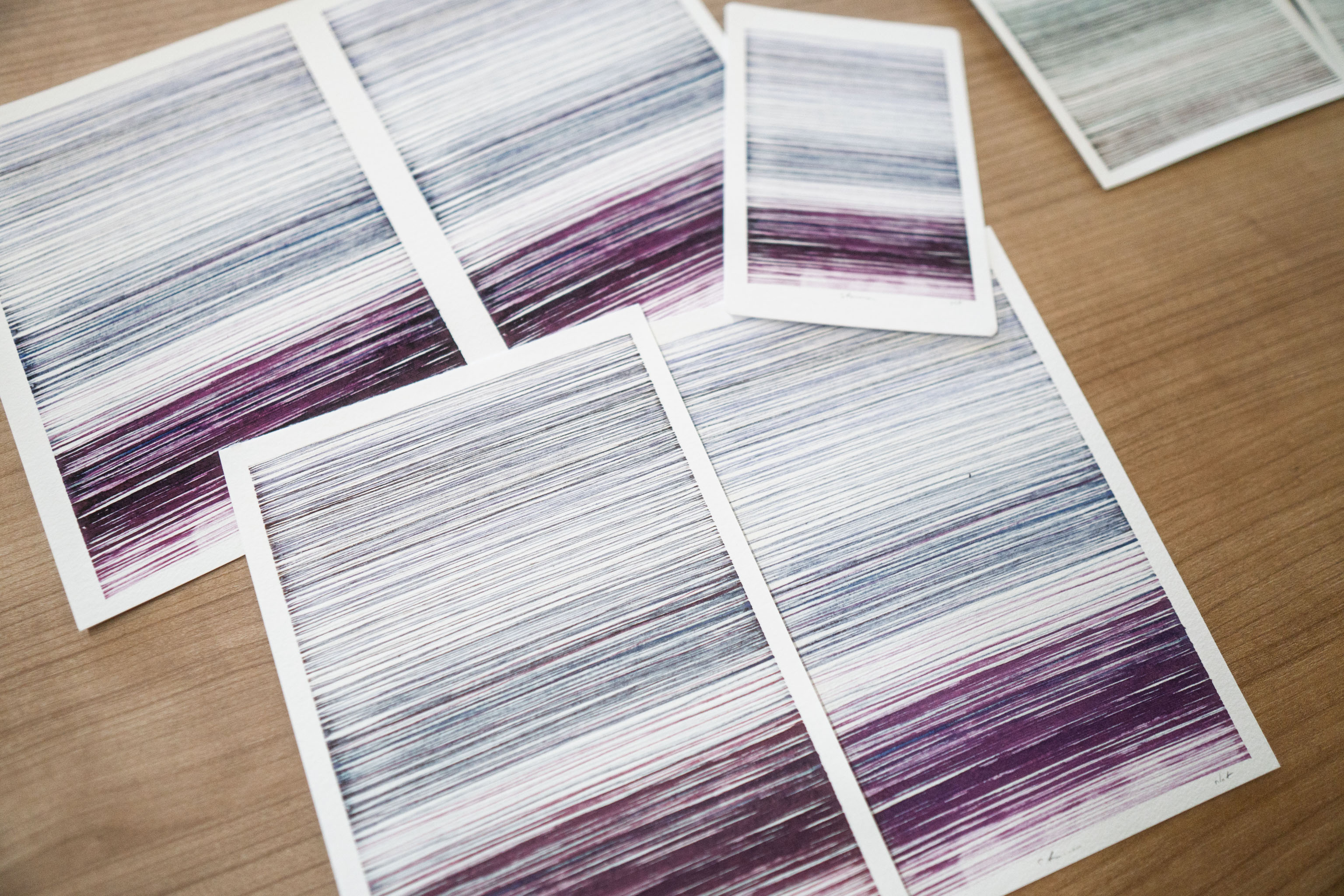
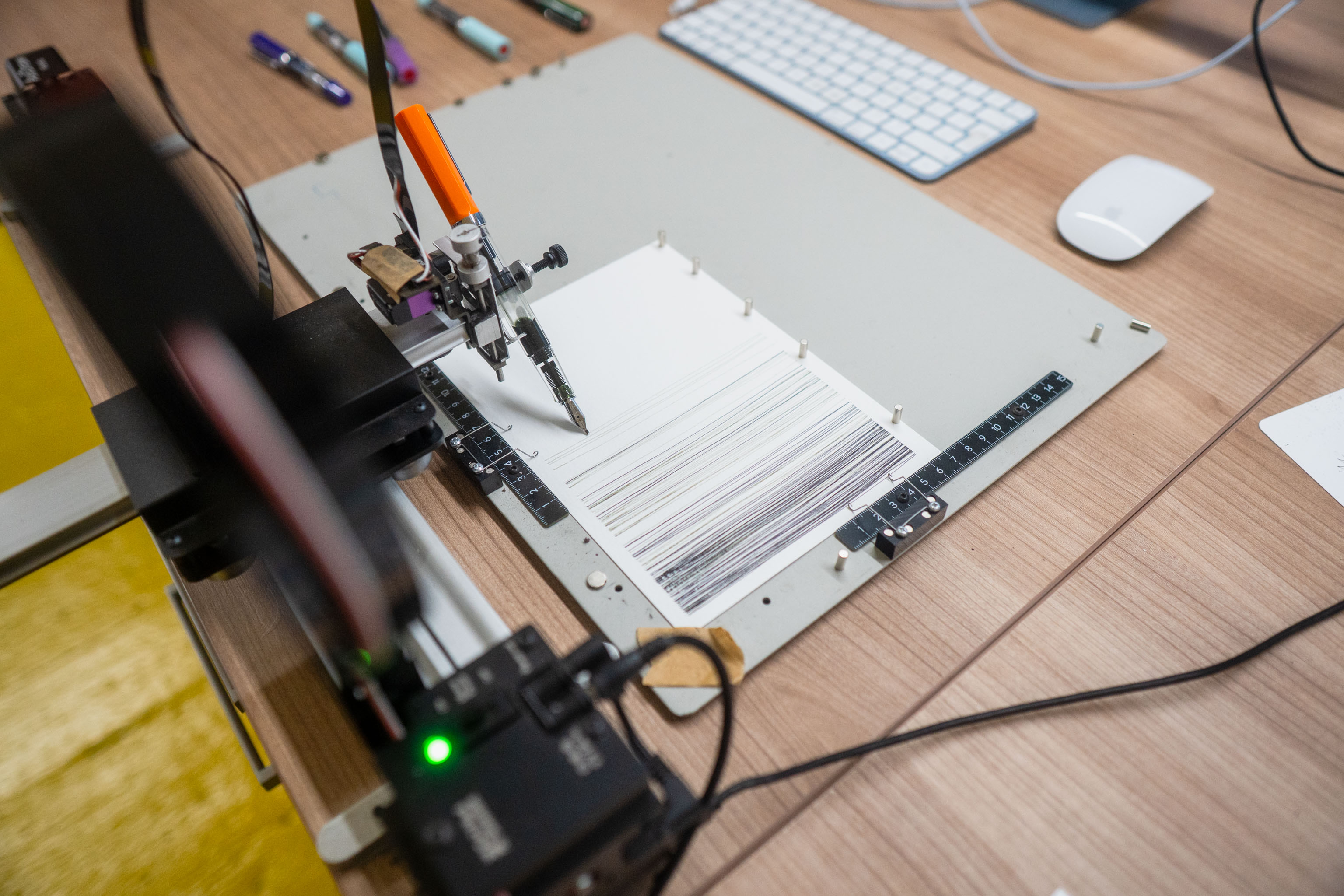
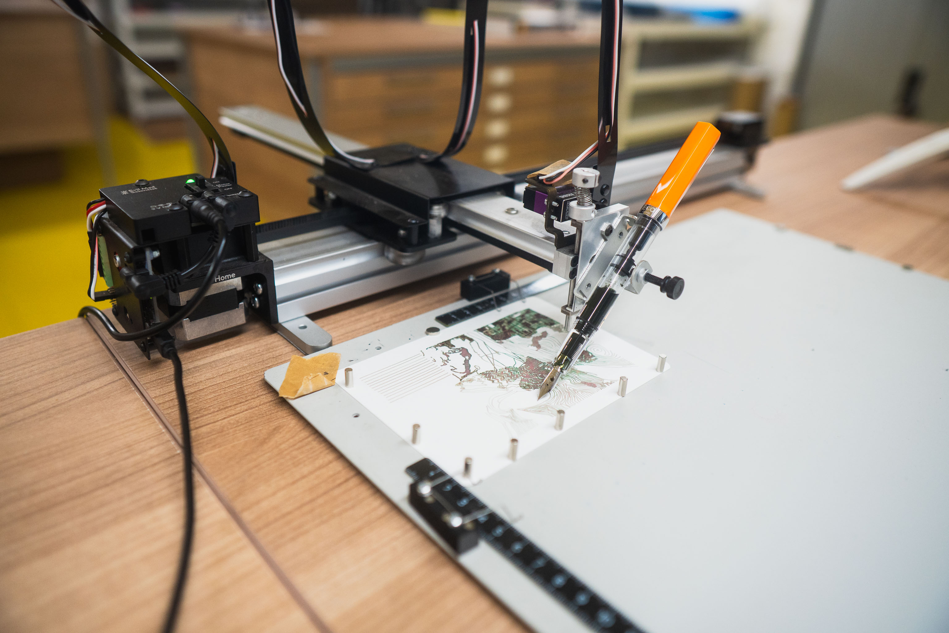
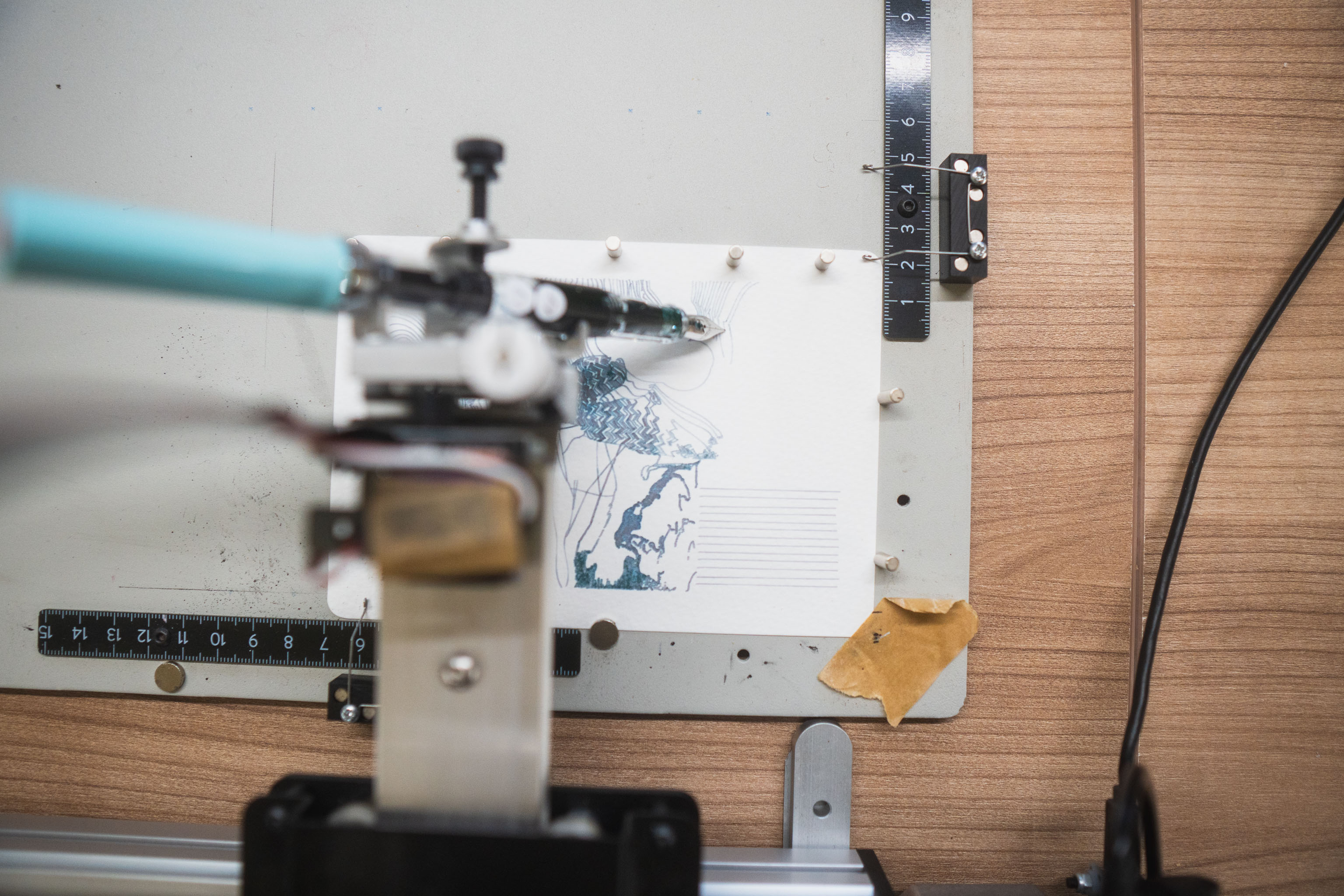
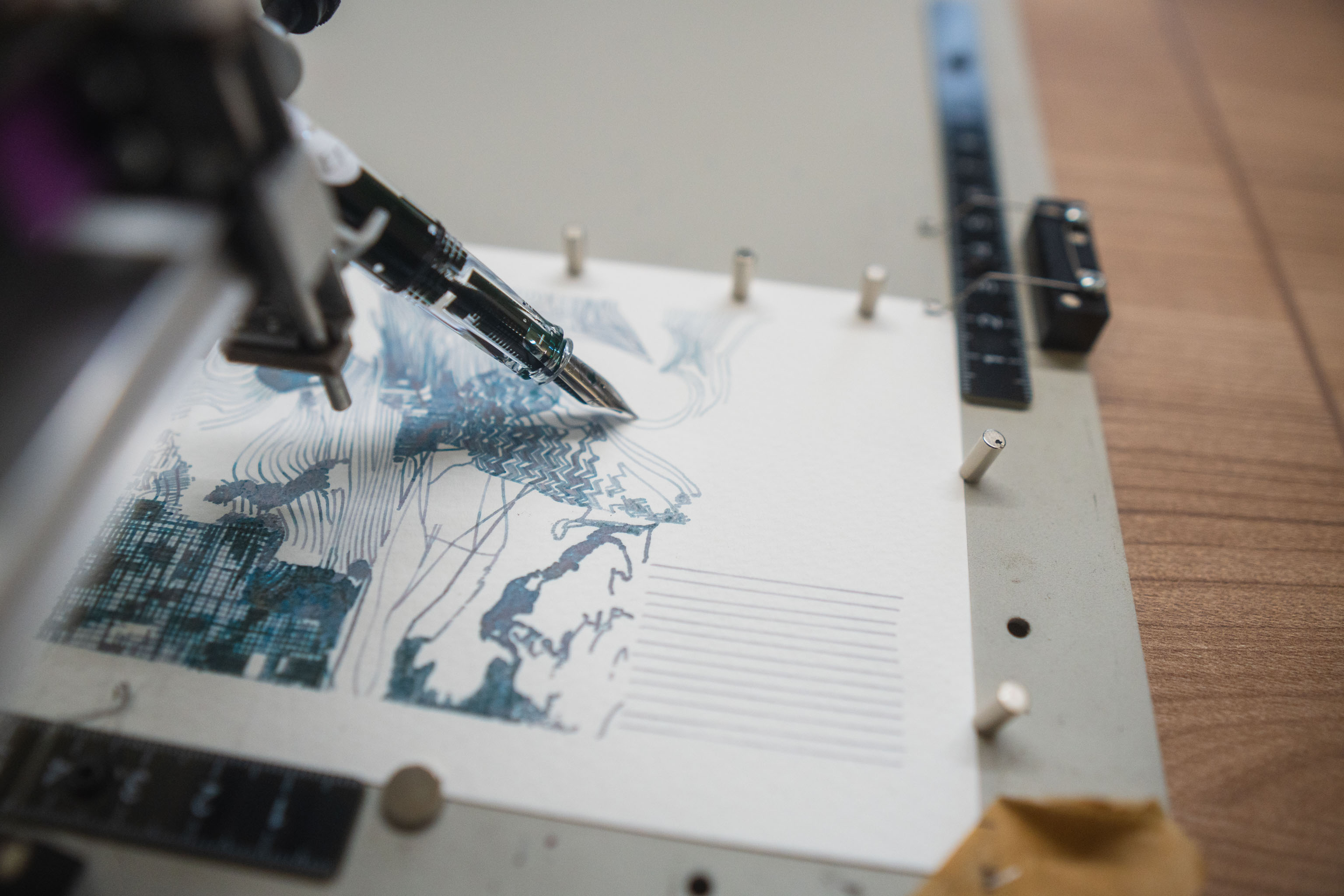
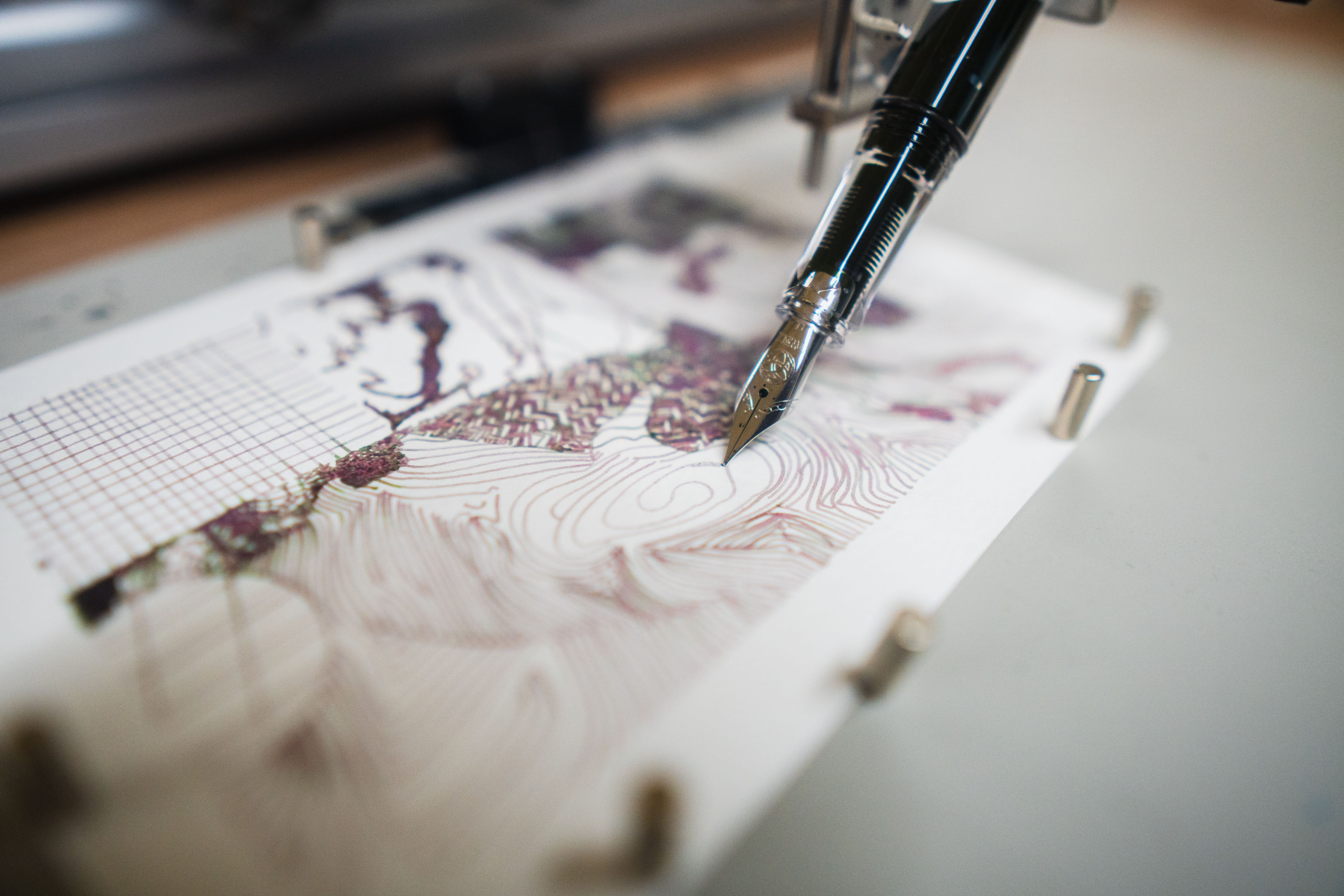
Shown in these photos are prints of the design, the code spits out SVG files for the drawing machine and PNG files to preview and send to the printer.
Below is shown outputs created with ink, fountain pens and the drawing machine.
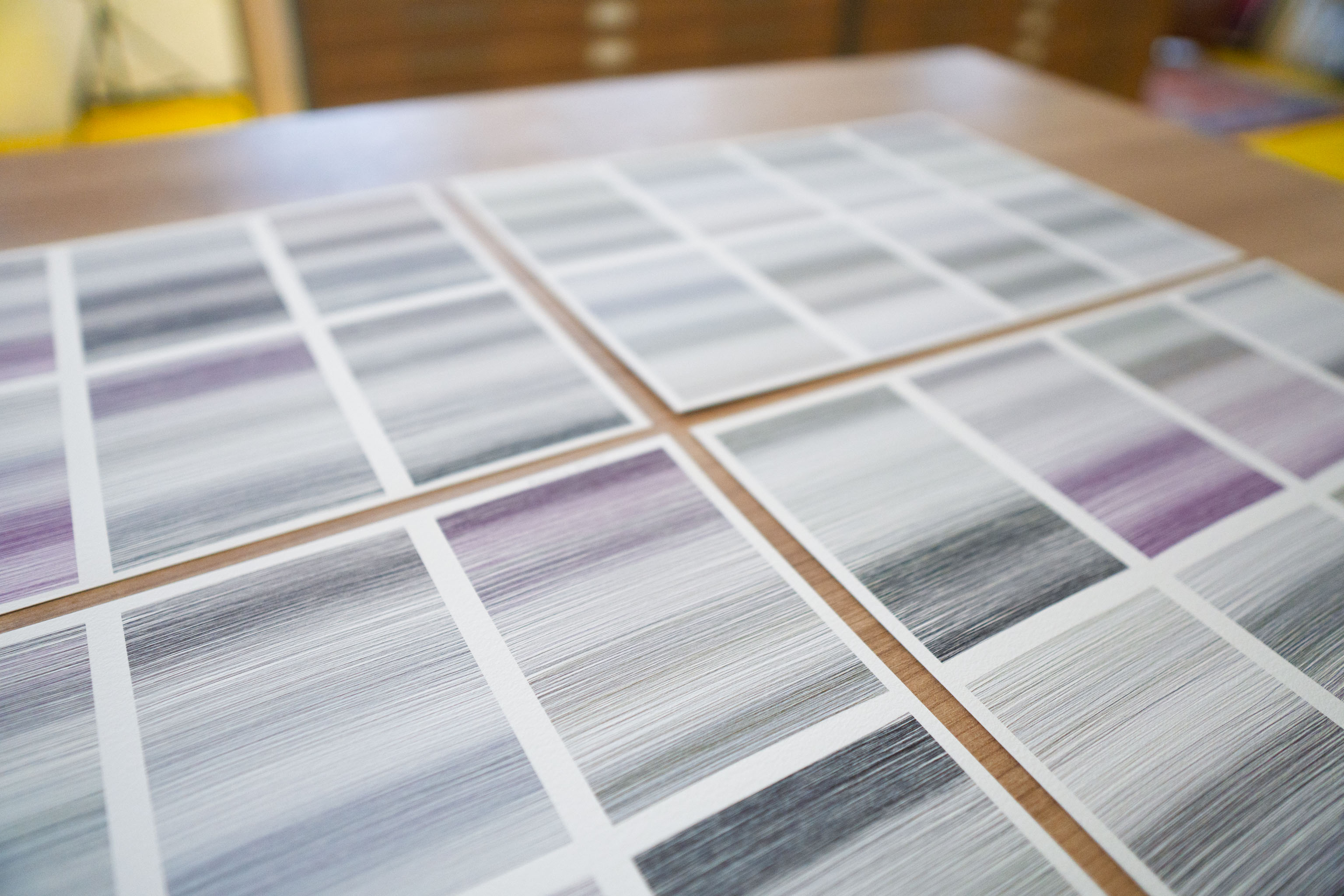
Meanwhile these are prints, printed on the printer 🖨️
Which are pretty close to the plots tbh, using textured paper helps I think, I could probably make them even better by thickening up the line a bit and adding some variation to it.
I also got my hands on an A3 scanner and had a go at scanning in a pen plot and then printing it out to see how it compared. It's not the best scanner in the world, but it's also an A3 scanner which is perfectly acceptable.
This is a whole bunch of test prints vs the original plot to tune up some of the sharpness.
It's been a while and not much more to report. I'd gotten hung up on trying to work out how to make the zine properly and too much of the perfectionism/procrastination kicked in.
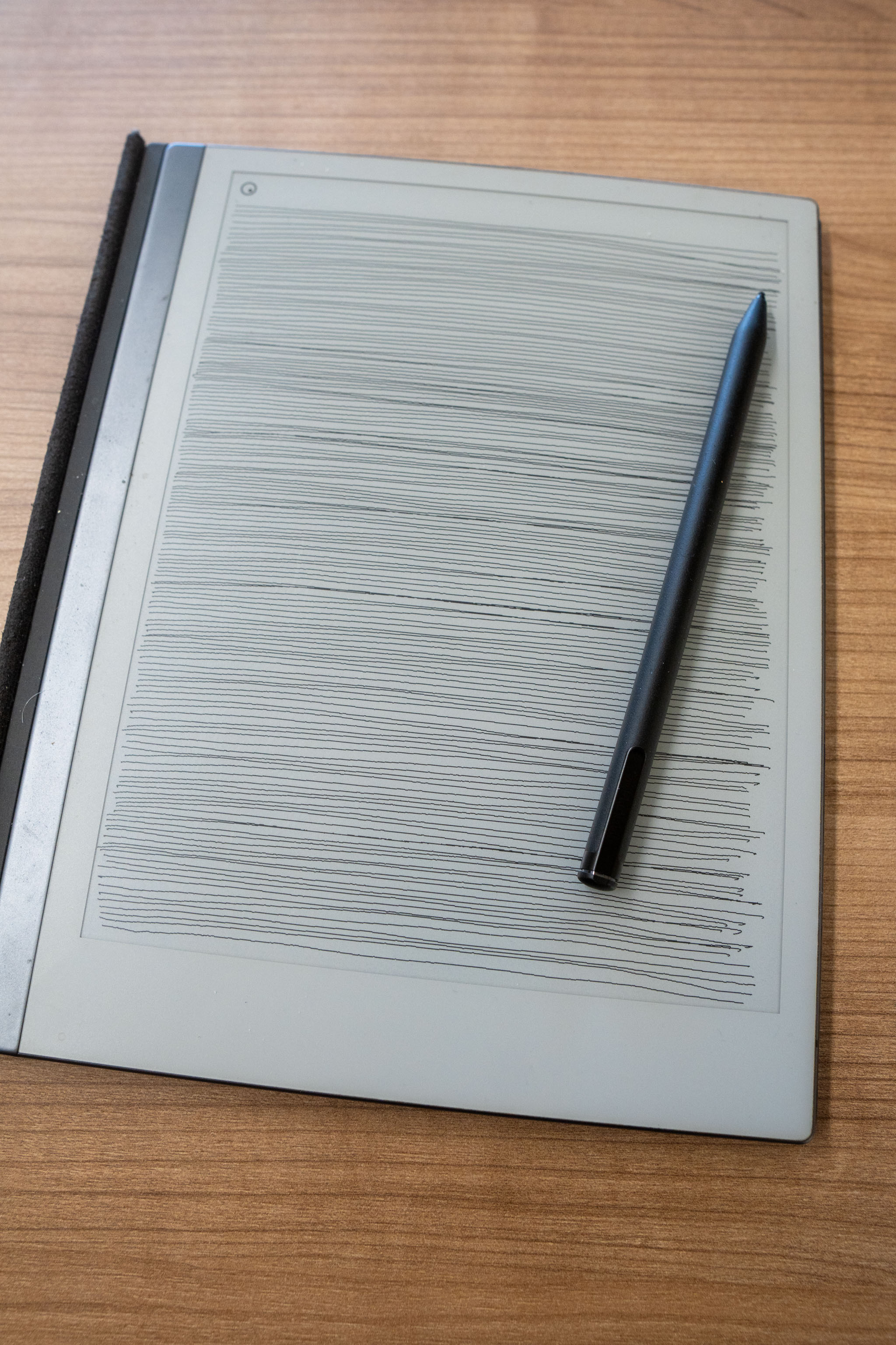
This is a photo I took of the lines I drew on the ReMarkable eInk tablet, so I could include it in the zine to show what I was upto.
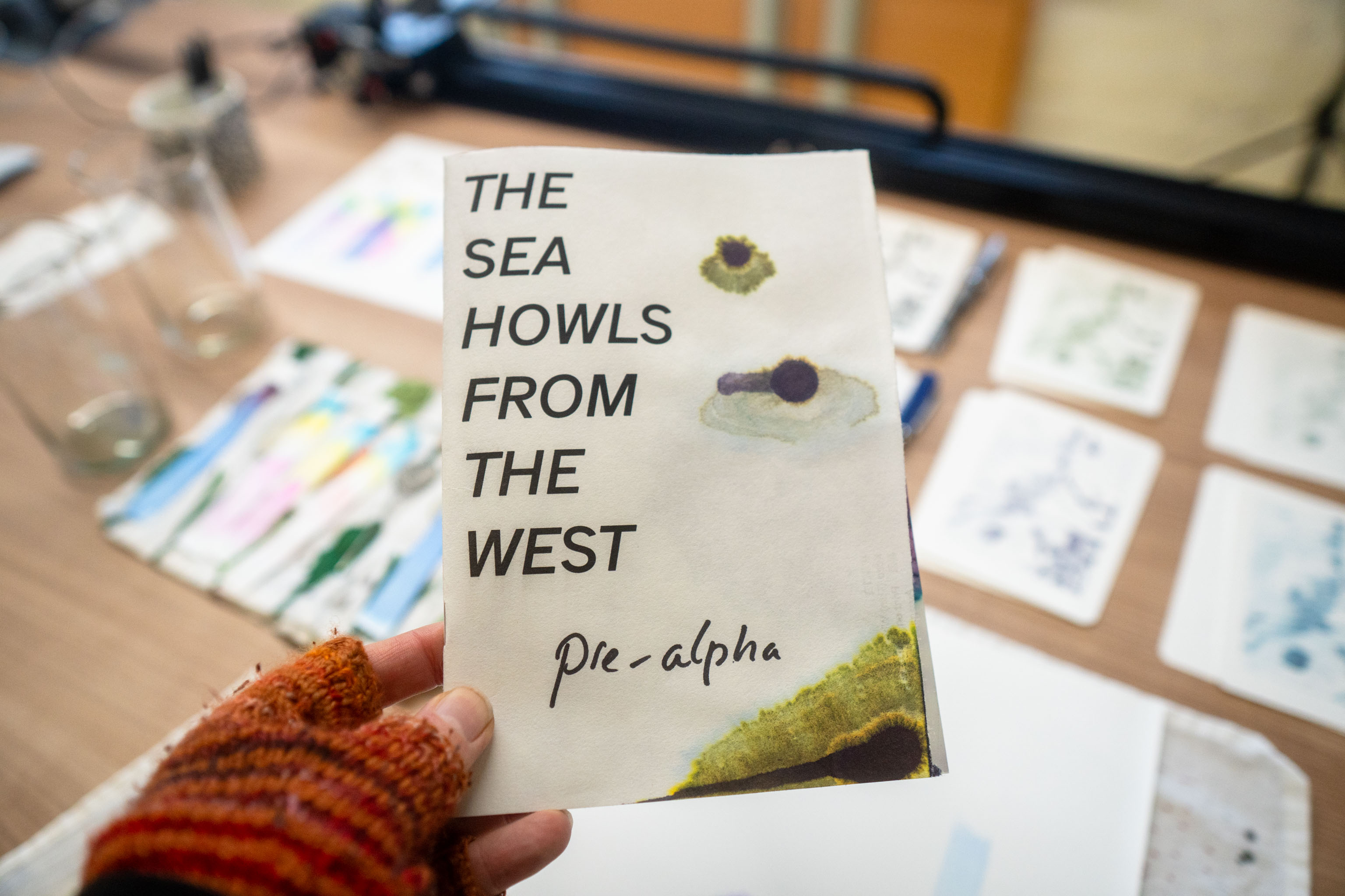
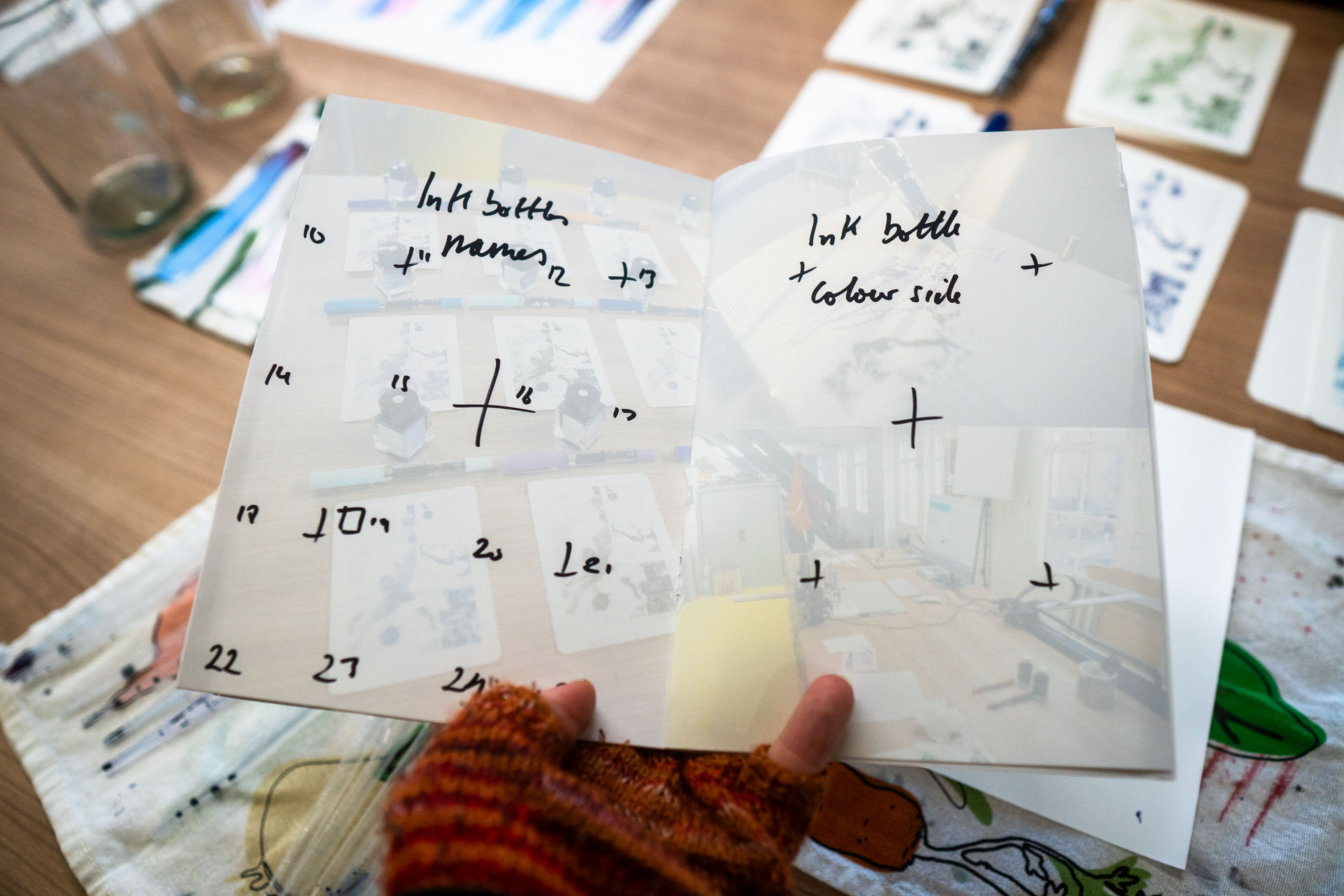
Possibly a bad idea, but decided to make a zine about the project. I've also decided that as I'm supposed to send some #ptpx (pen plotter postcard exchange) postcards to 16 people so I can kill two (three) birds with one stone and send these postcards and zines to those people.
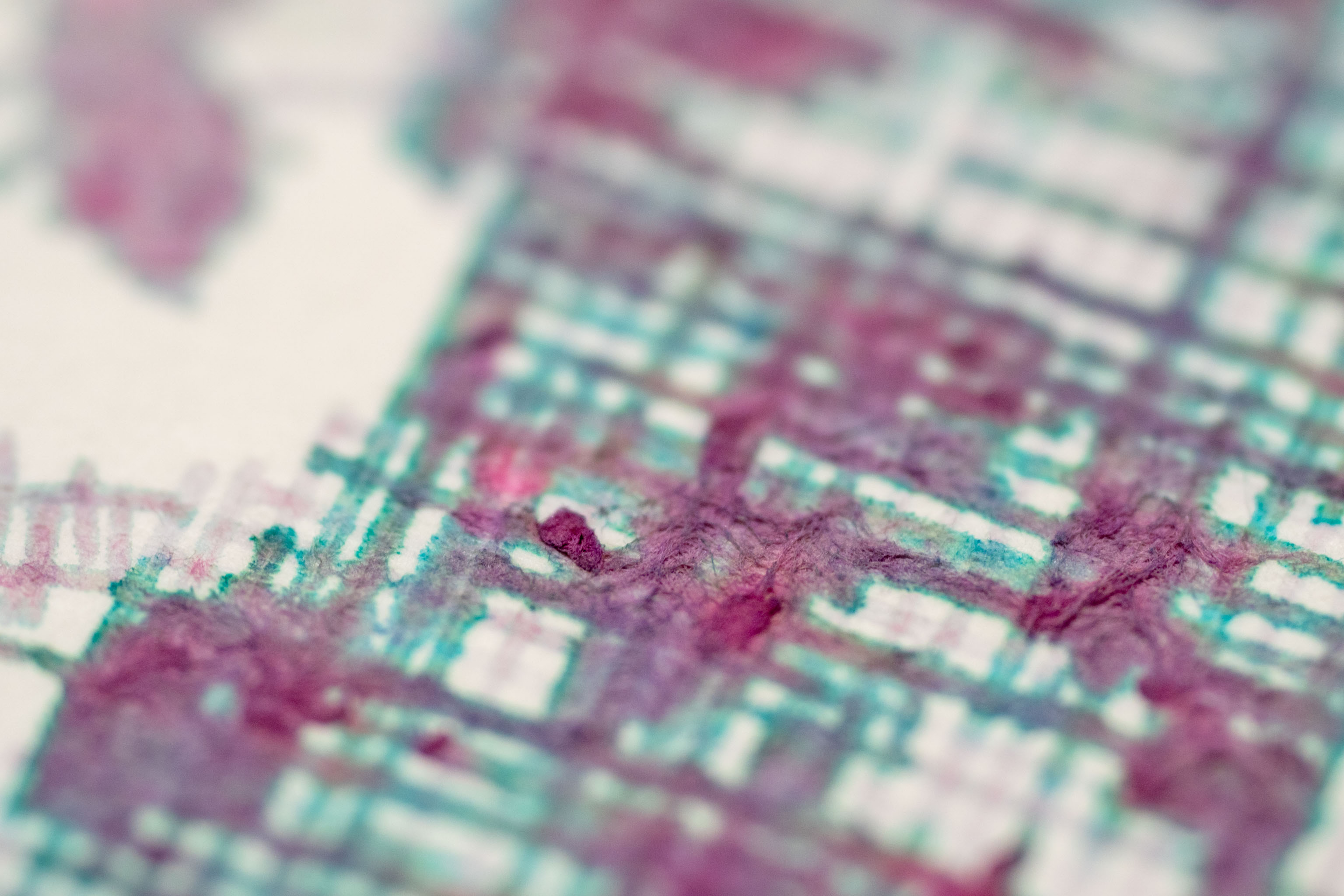
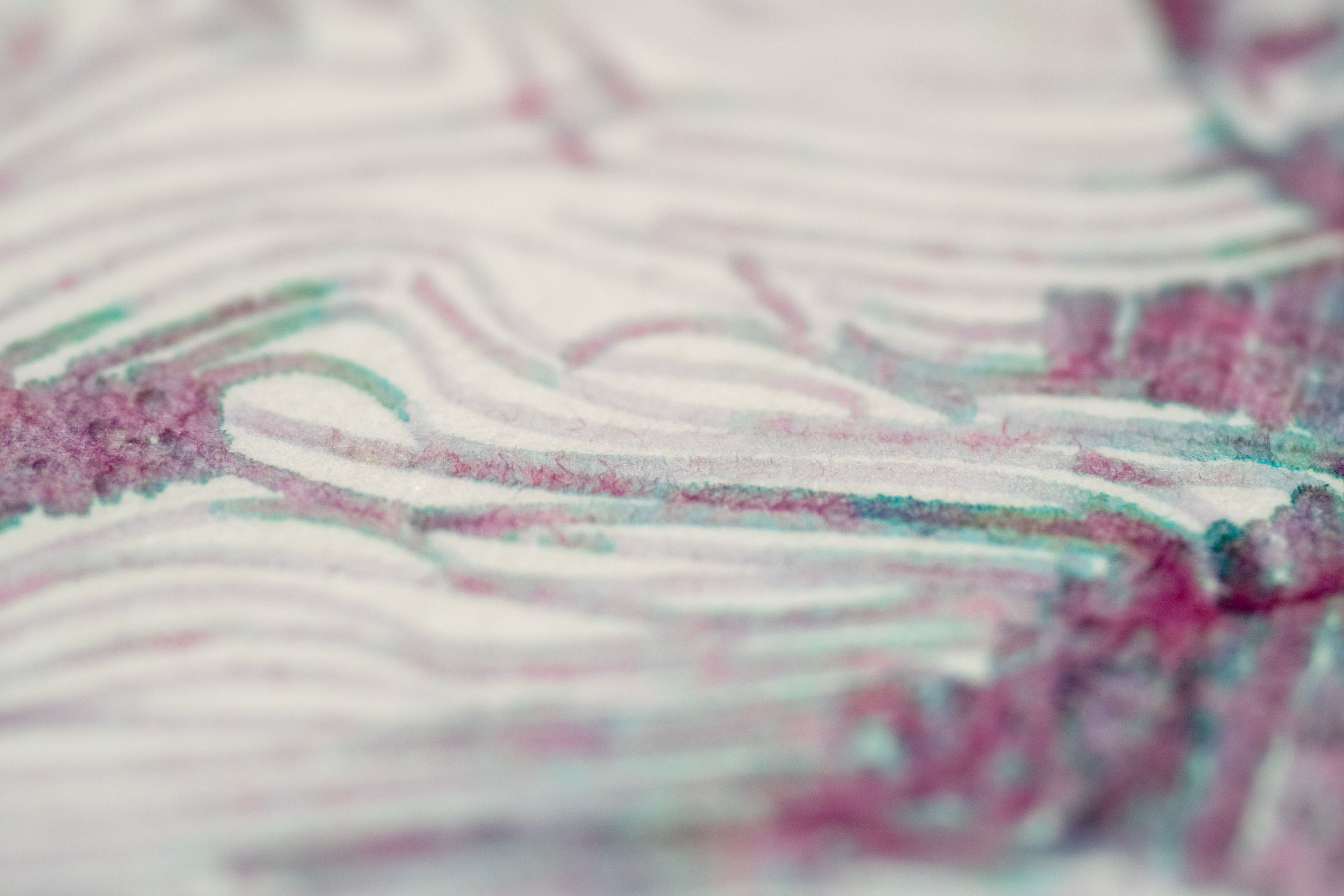
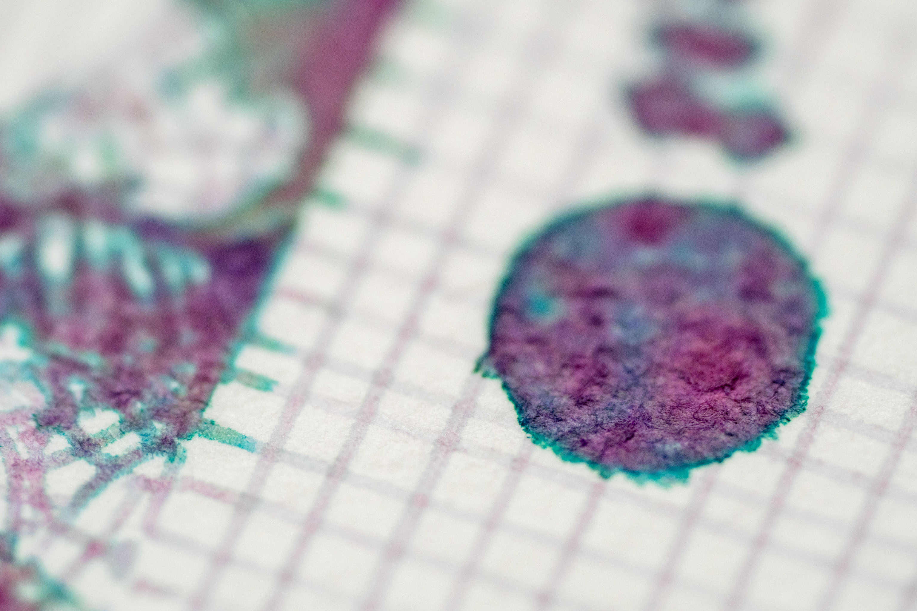
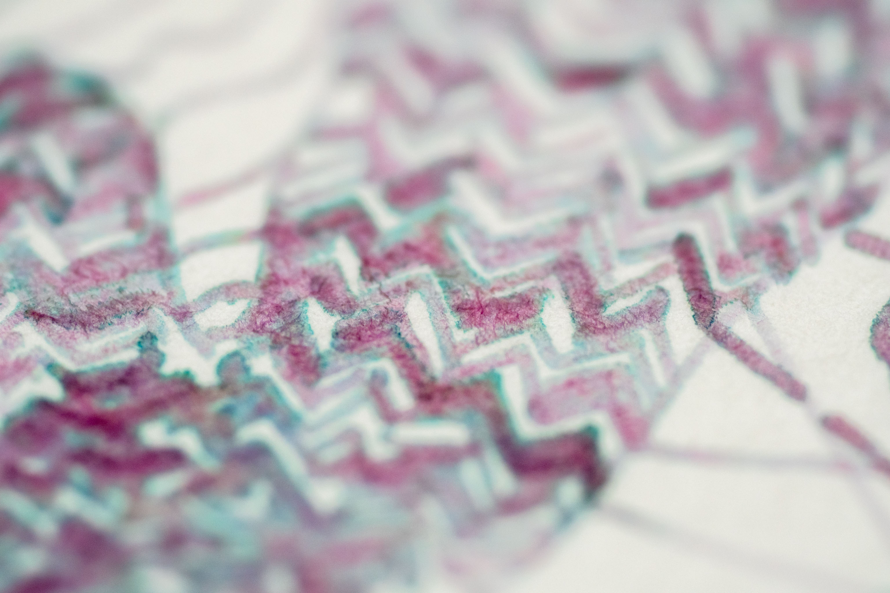
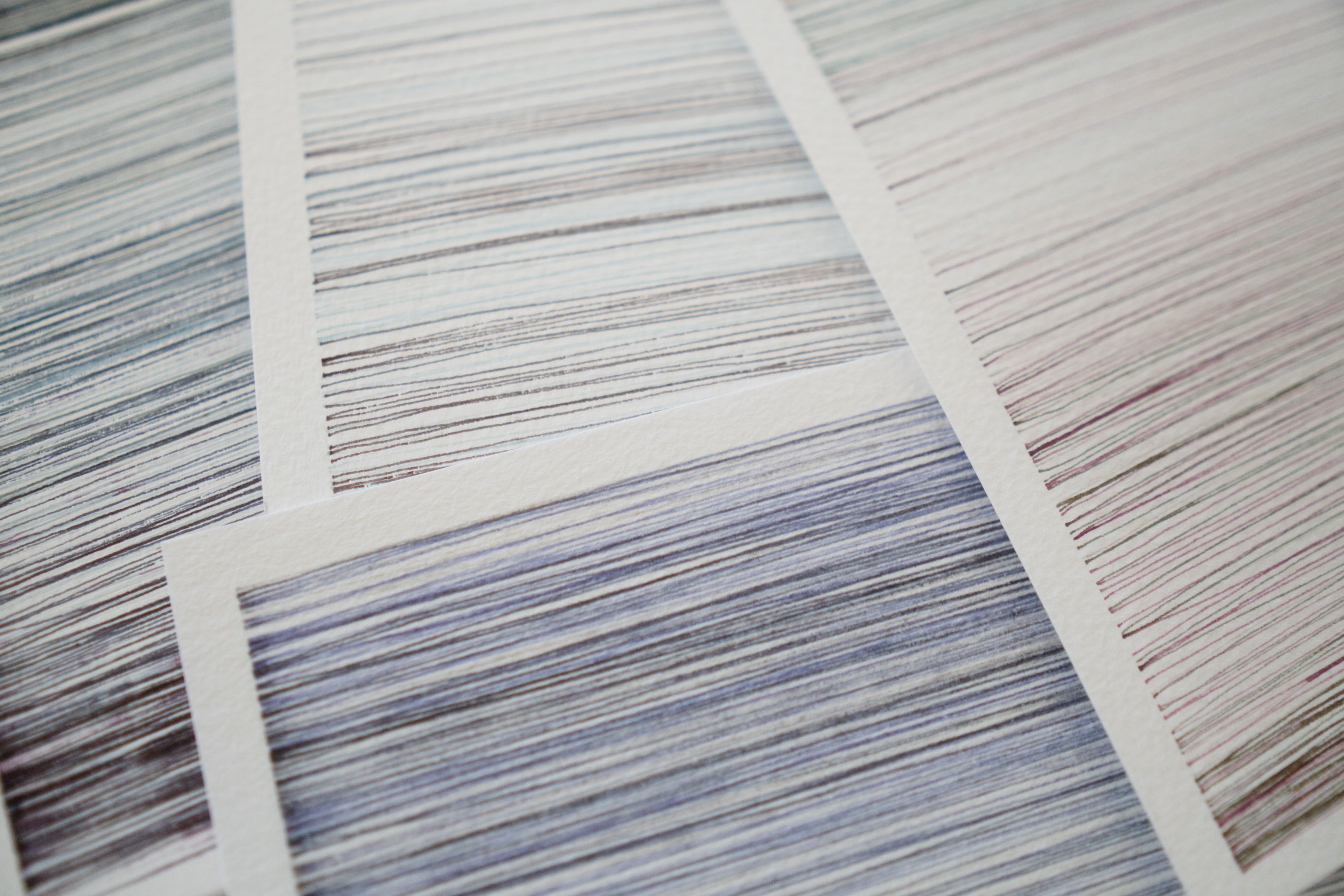
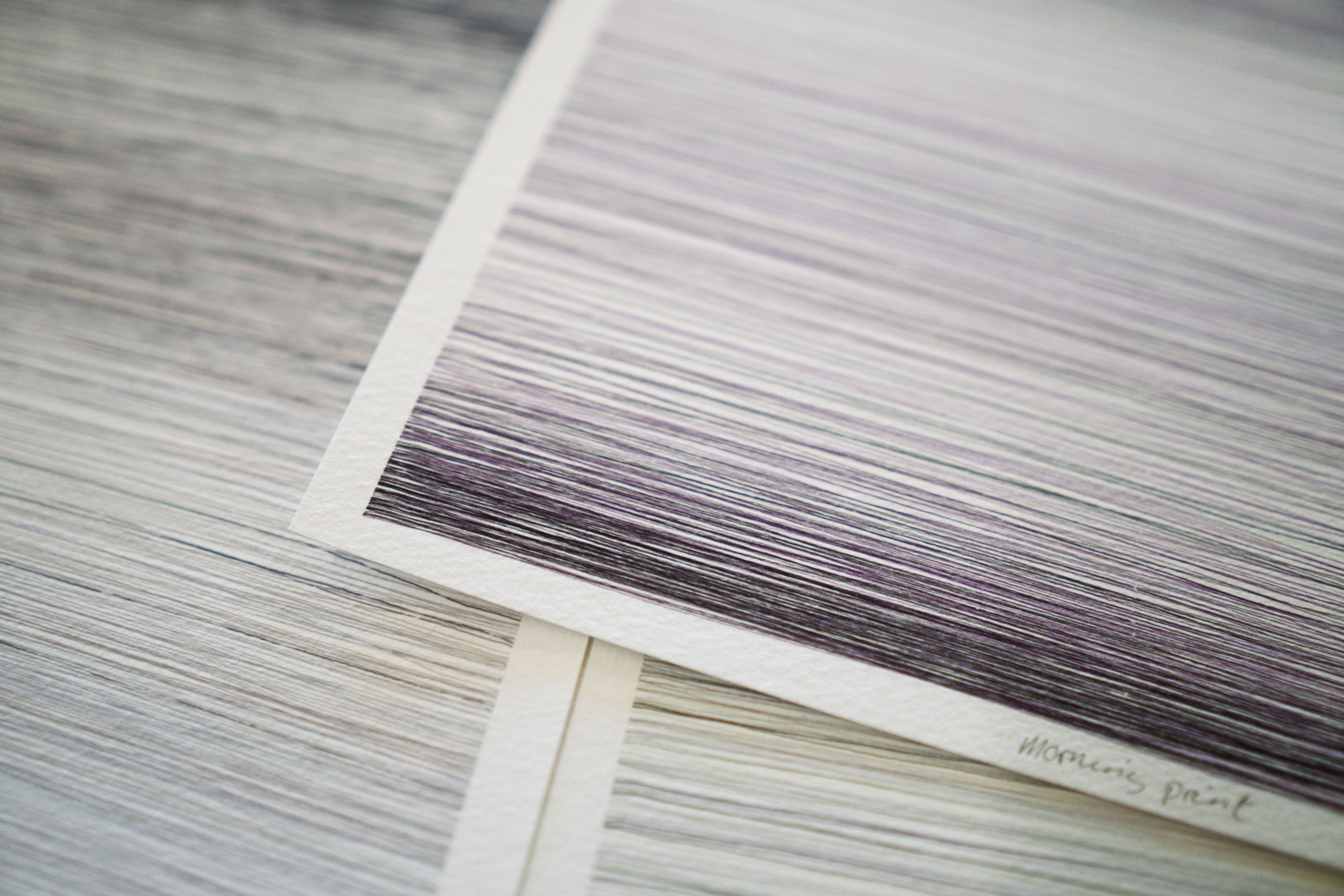
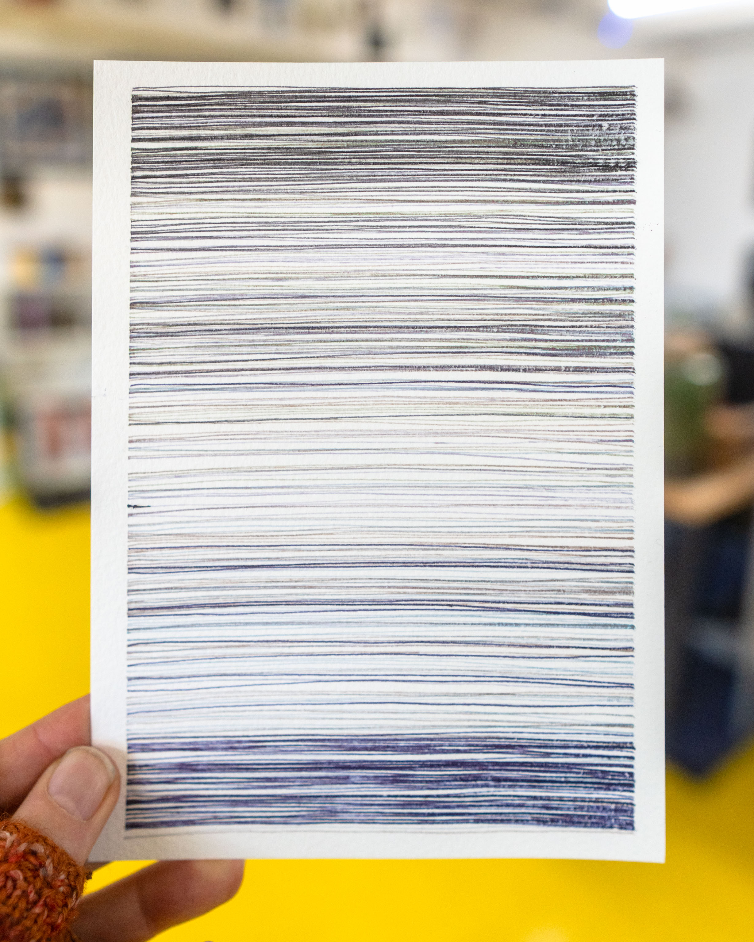
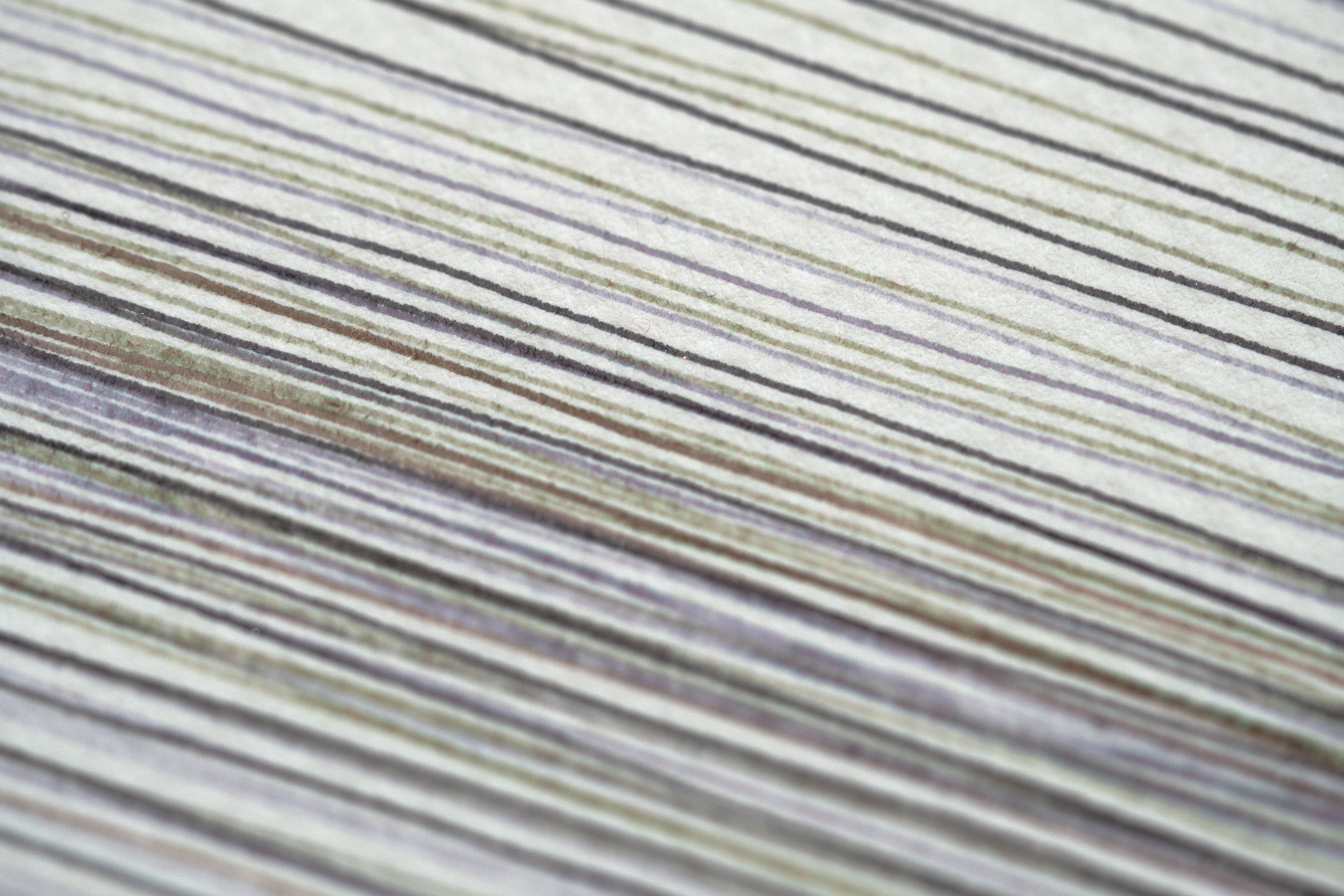
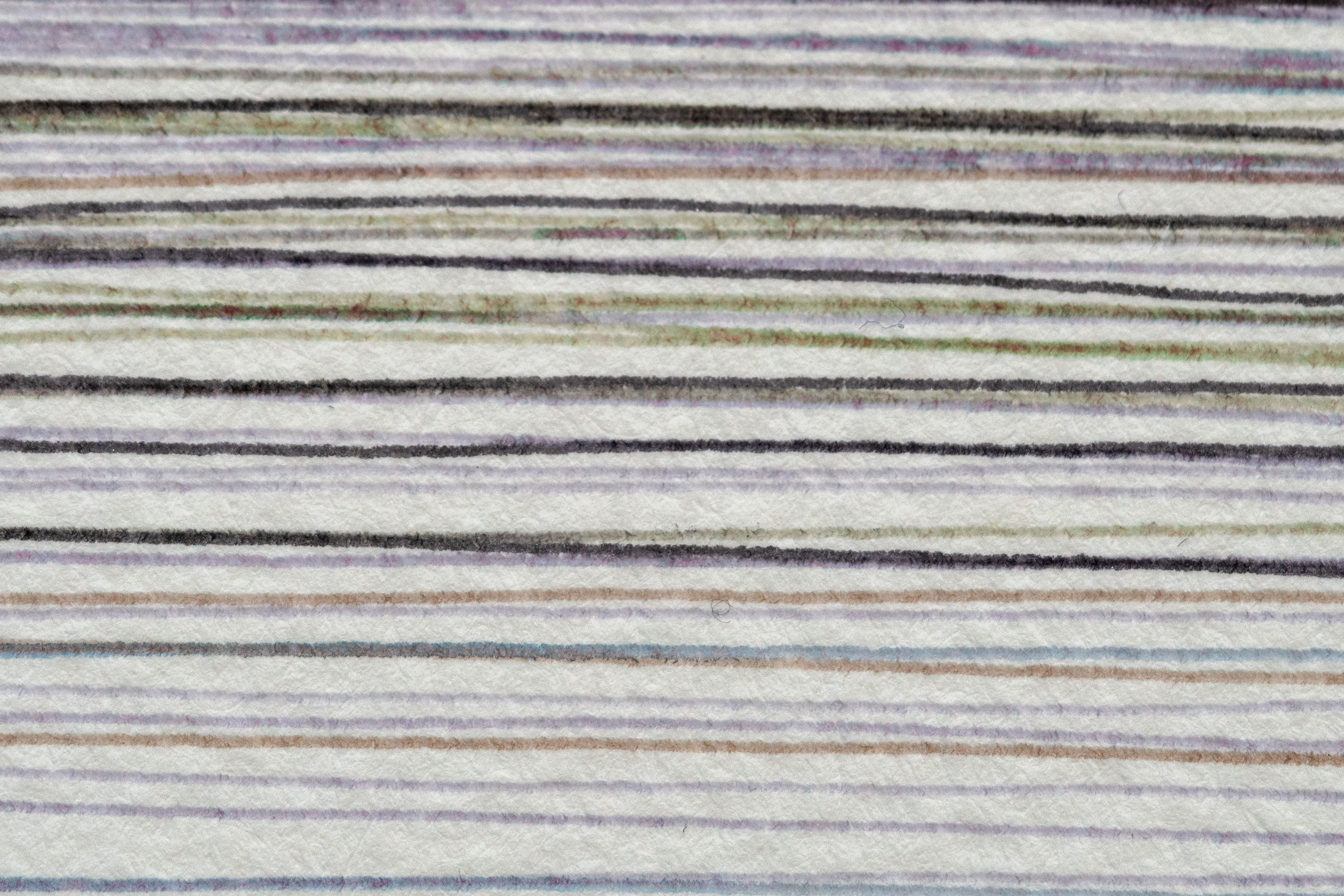
Some close ups of the lines in the plot. The idea is the code picks random inks from the whole range and then draws them in random-ish bands like this to give some colour-fields.
This "design" of lots of horizontal likes is eventually going to be the sky of the image, taking up only the top half of the page, the bottom half will be the sea.
Some more tests of different inks, because why not, besides the photos look good on social media 😁
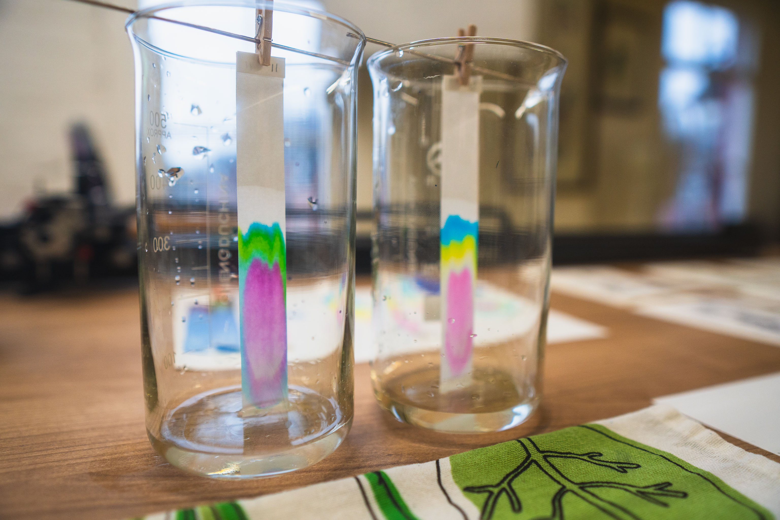
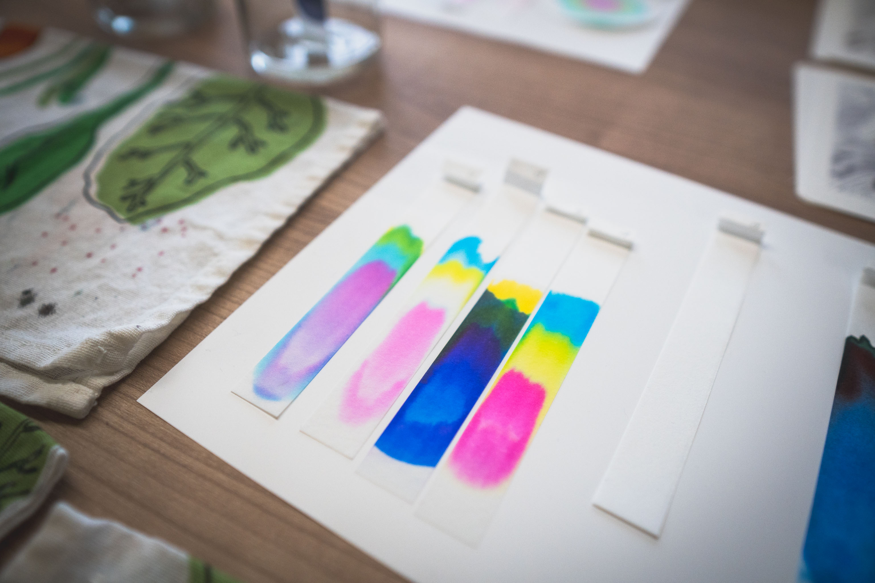
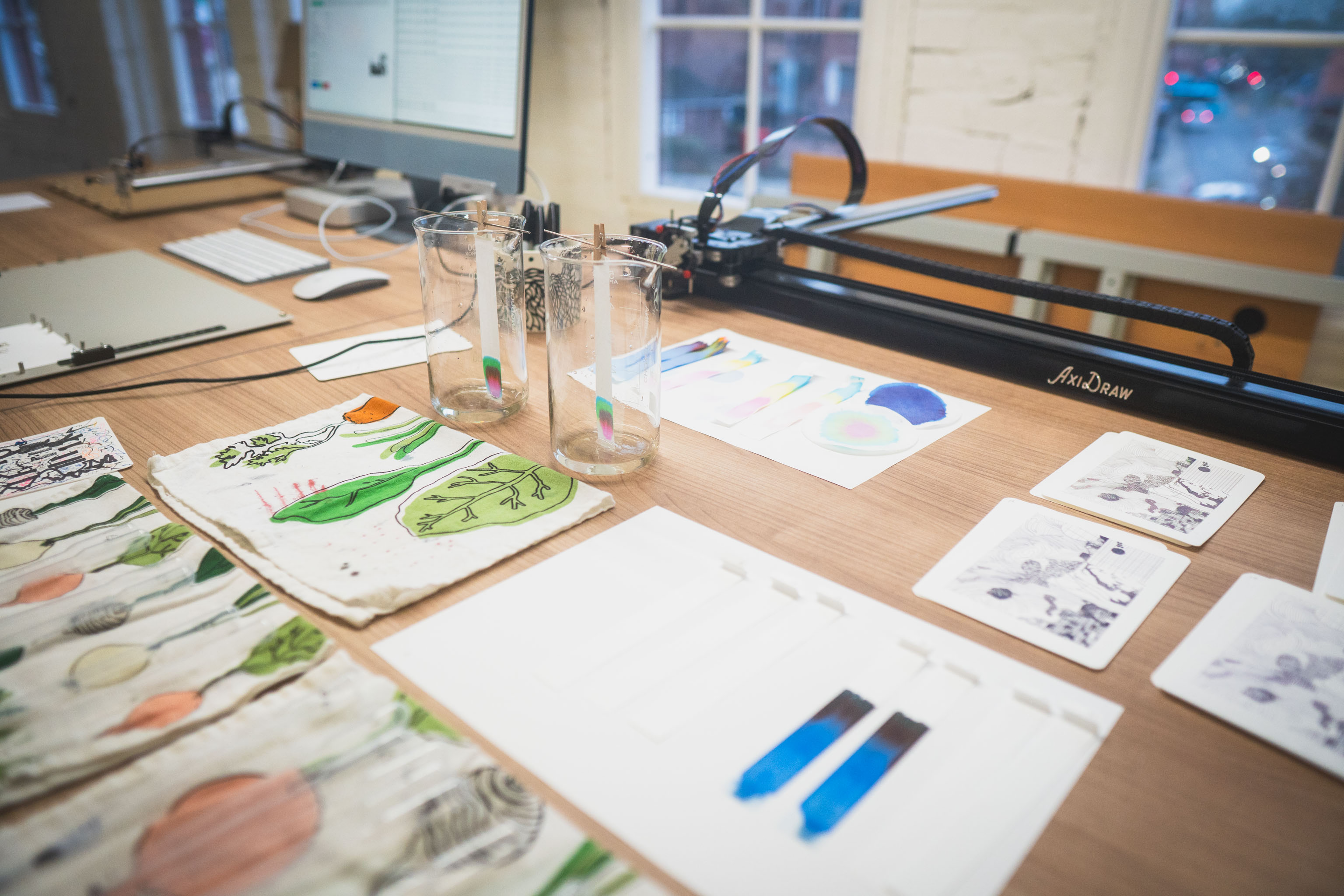
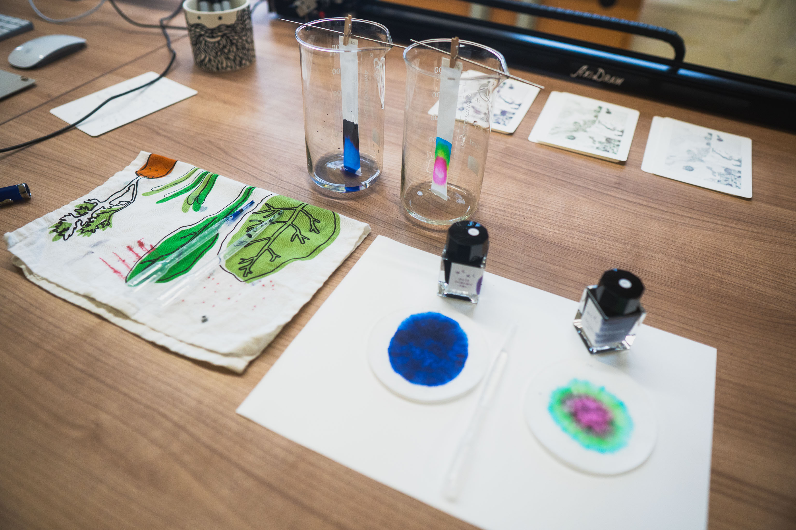
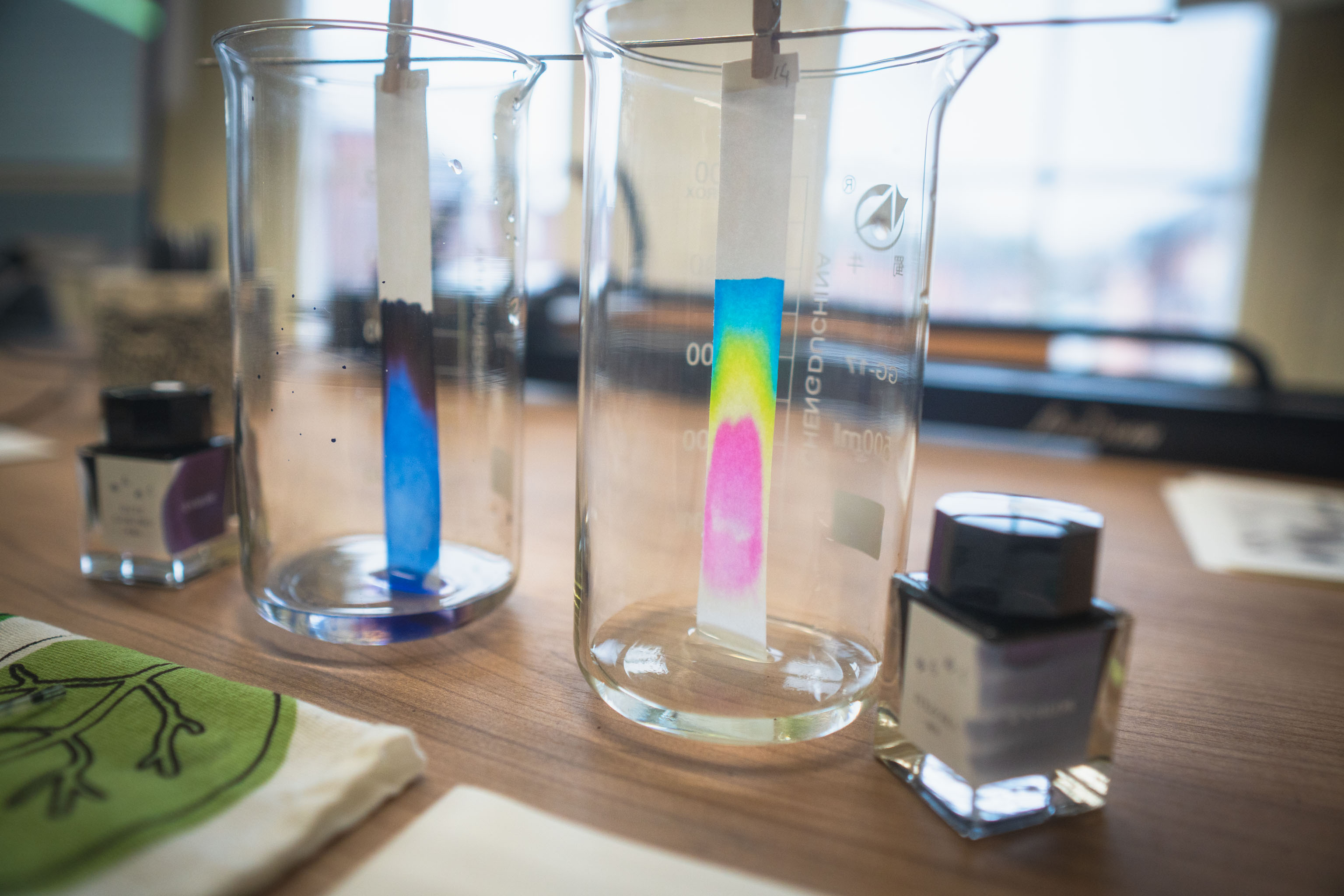
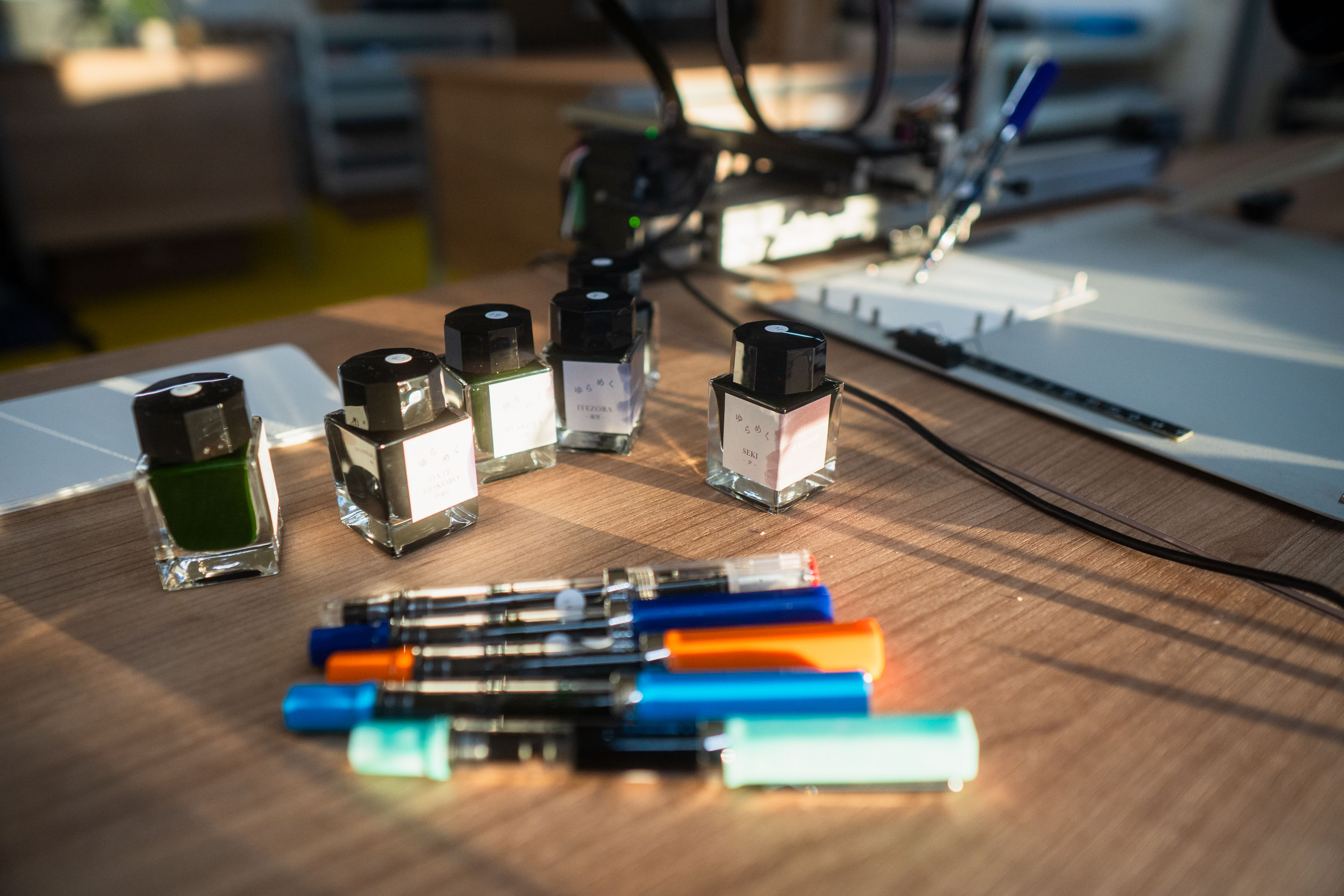
I thought it'd be fun to do some "science" and work out what colours went into each ink.
These two inks are obviously very different, but the others are more subtle. They tend to be light grey in tone but some "sheen" to greens while others have more blue in them. They go down as the same grey, but as the ink tries or feathers on the paper the other colours start to come out.
Did some more plots and then decided to just go and buy some more inks, feels like I'm going to use them for the project so why not.
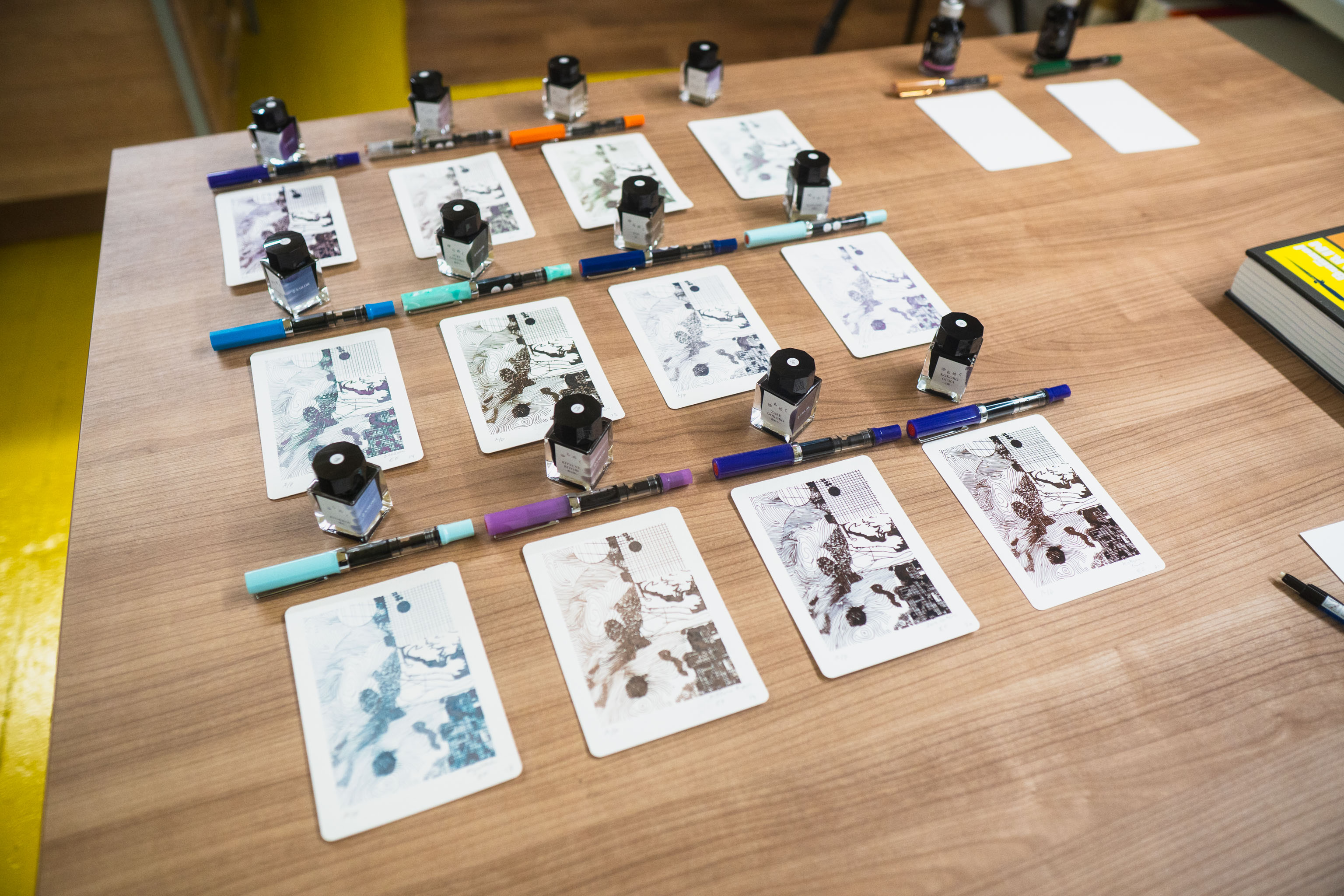
Today was mainly about grabbing a couple more inks and a pen for each one and trying out some more plots. Or rather the same plot but in different inks.
I probably should have started taking photos sooner, but sometimes you don't know a project is going to be one when it's just one out of a number of experiments.
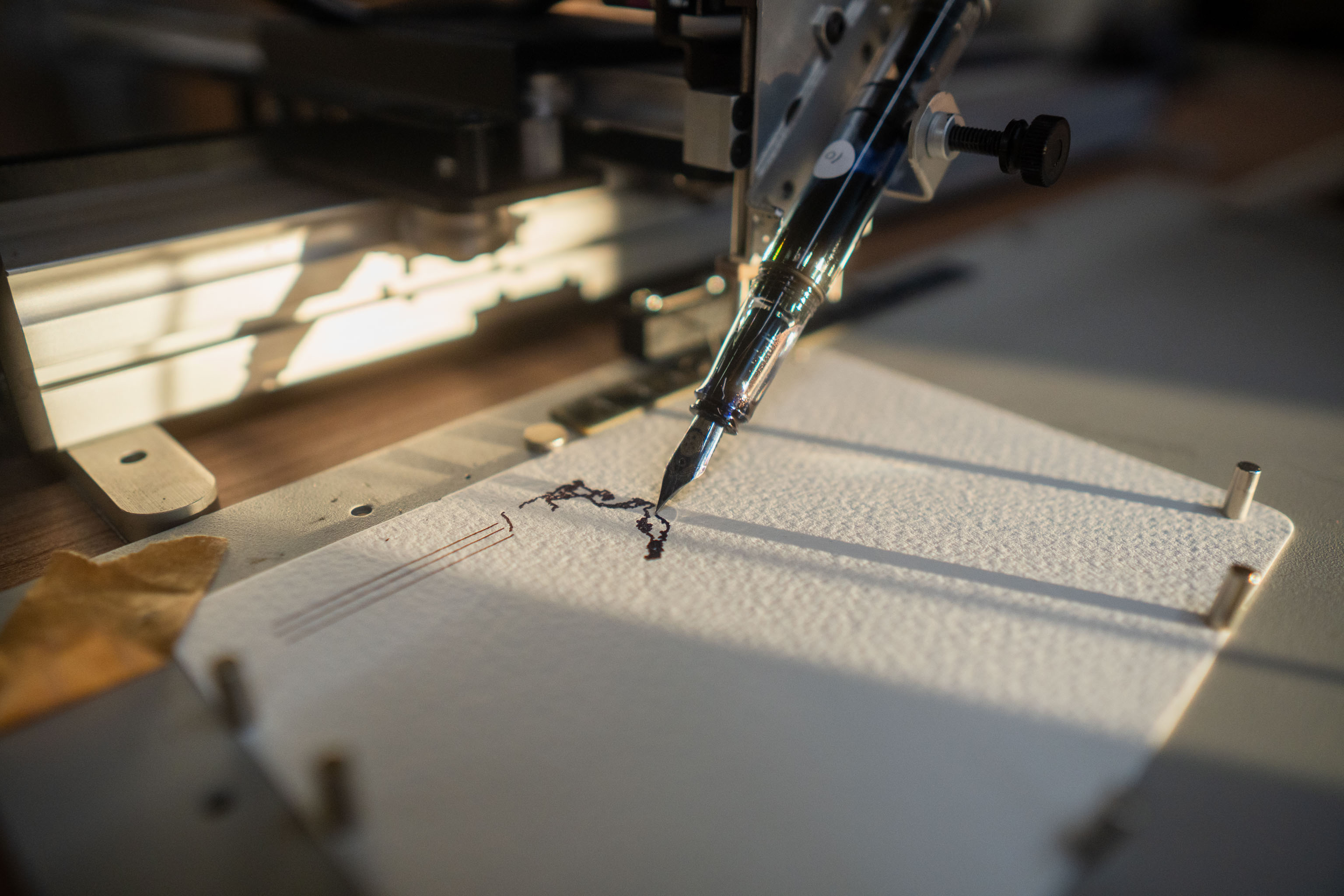
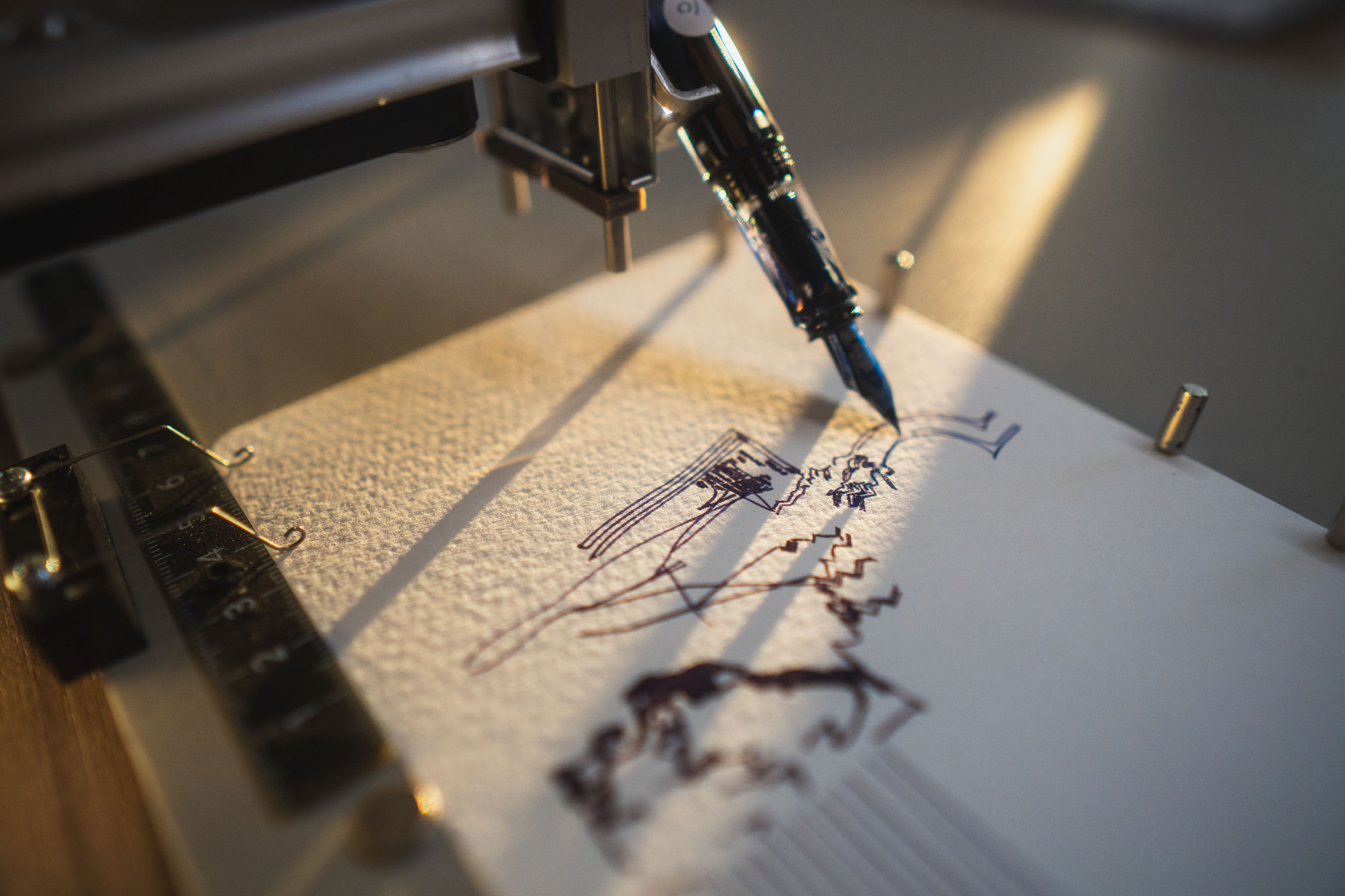
In this has I wanted to play with hand drawn elements and test out various inks I had a hunch would be interesting, and a vague mood from standing on the coastline of Wales looking out to the sea.